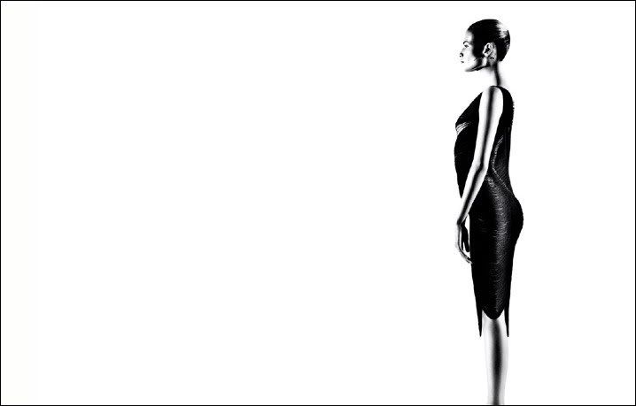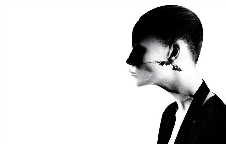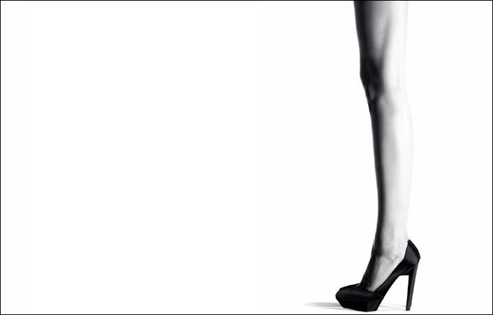
The fringe dresses looked gorgeous on the runway and even better in print, with some added movement. Now the first ads are appearing, and photographer Willy Vanderparre has taken a more minimalistic approach to showcasing the clothes.

Model Natasha Poly is working it in these haunting black and white profile shots. This is effective photography; eye-catching without being annoying, elegant yet simple. The jewelry shot is by far my favourite.

As cliché as it might sound; I just can't wait to see these in print!
Pictures from jilsander.com via The Fashion Spot


No comments:
Post a Comment